How to Create Interactive Excel Dashboard Step by Step
7 هزار بار بازدید -
6 ماه پیش
-
Example How to Create Interactive
Example How to Create Interactive Excel Dashboard. Transform your data into a dynamic story with our step-by-step guide on creating an interactive dashboard in MS Excel. In this training video, you will learn how to develop summary charts for dashboards using Excel's powerful features. From data visualization to user-friendly navigation, unleash the power of your insights!
We provide a free Excel dashboard template for furniture manufacturing to get you started. Discover how to design an Excel dashboard for a furniture business that incorporates interactive slicers and filters for modern analysis. Download our free Excel dashboard template for production analysis and learn to track key performance indicators (KPIs) in the manufacturing sector.
The video covers everything you need to know about creating a custom Excel dashboard for your business. We'll show you how to use Excel to visualize production data, analyze sales, and manage inventory efficiently. Explore how to set up an Excel dashboard for cash flow analysis in manufacturing and analyze sales and inventory data effectively.
Whether you're new to Excel or looking to refine your skills, this comprehensive guide will equip you with the tools needed to create a modern design Excel dashboard for manufacturing. Join us and master the art of building interactive Excel dashboards that can drive success for your business!
Time codes:
00:00:05 Dashboard Grid – Template design structure.
00:15:41 Cash Flow Chart – The first element of data presentation on the dashboard. Start → 00:01:49
00:23:32 Data selection for the period on the chart – Sales by categories. Start → 00:19:00
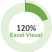
00:30:48 Sector Donut Chart – Distribution by categories. Start → 00:24:07
00:34:23 Chart Sorting – Inventory levels in warehouses. Start → 00:31:00
00:38:40 Bar Histogram – EBITDA analysis. Start → 00:35:15
00:42:04 Line Chart in Minimalist Design Style – Lost work time. Start → 00:39:30
00:47:22 Speedometer Diagram – Production capacity. Start → 00:42:12
00:51:03 Two-layer Radar Chart – Resource distribution. Start → 00:47:38
Music:
Shadows - Anno Domini Beats
Mist - Odonis Odonis
Stellar Wind - Unicorn Heads
Schizo - Anno Domini Beats
Warzone - Anno Domini Beats
We provide a free Excel dashboard template for furniture manufacturing to get you started. Discover how to design an Excel dashboard for a furniture business that incorporates interactive slicers and filters for modern analysis. Download our free Excel dashboard template for production analysis and learn to track key performance indicators (KPIs) in the manufacturing sector.
The video covers everything you need to know about creating a custom Excel dashboard for your business. We'll show you how to use Excel to visualize production data, analyze sales, and manage inventory efficiently. Explore how to set up an Excel dashboard for cash flow analysis in manufacturing and analyze sales and inventory data effectively.
Whether you're new to Excel or looking to refine your skills, this comprehensive guide will equip you with the tools needed to create a modern design Excel dashboard for manufacturing. Join us and master the art of building interactive Excel dashboards that can drive success for your business!
Time codes:
00:00:05 Dashboard Grid – Template design structure.
00:15:41 Cash Flow Chart – The first element of data presentation on the dashboard. Start → 00:01:49
00:23:32 Data selection for the period on the chart – Sales by categories. Start → 00:19:00
00:30:48 Sector Donut Chart – Distribution by categories. Start → 00:24:07
00:34:23 Chart Sorting – Inventory levels in warehouses. Start → 00:31:00
00:38:40 Bar Histogram – EBITDA analysis. Start → 00:35:15
00:42:04 Line Chart in Minimalist Design Style – Lost work time. Start → 00:39:30
00:47:22 Speedometer Diagram – Production capacity. Start → 00:42:12
00:51:03 Two-layer Radar Chart – Resource distribution. Start → 00:47:38
Music:
Shadows - Anno Domini Beats
Mist - Odonis Odonis
Stellar Wind - Unicorn Heads
Schizo - Anno Domini Beats
Warzone - Anno Domini Beats
- #education
- #free_excel_dashboard_template_for_furniture_manufacturing
- #interactive_excel_dashboard_with_slicers_and_filters
- #modern_design_excel_dashboard_for_manufacturing
- #download_free_excel_dashboard_template_for_production_analysis
- #excel_dashboard_for_cash_flow_analysis_in_manufacturing
- #create_a_custom_excel_dashboard_for_your_business
6 ماه پیش
در تاریخ 1402/11/13 منتشر شده
است.
7,056
بـار بازدید شده